When you’re diagnosing a usability snag, or coming up with a new design idea, it’s helpful to know what level you’re working at.
Over the years, designers and researchers have defined various levels, reflecting their view of design and what they emphasize.
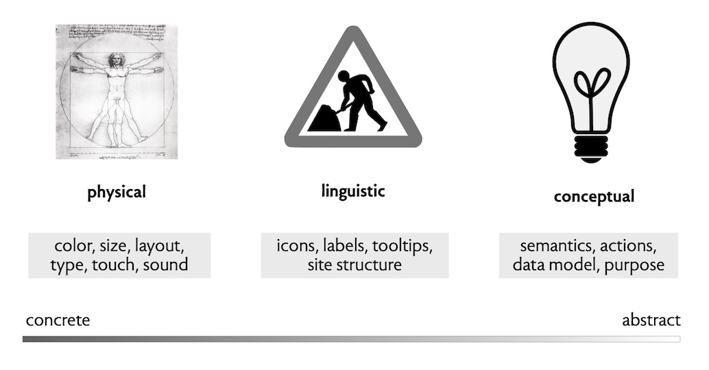
I find the following scheme most helpful:
- Physical. If you want to think of levels as low and high, this one is at the bottom. It’s the level of design in which you’re concerned about the physical (and physiological) qualities of human users. So it might involve physical things (like picking colors), but it includes less tangible aspects too (such as how long an action can take before you need to show a progress bar). To do this kind of design, you need to know a bit about human anatomy and physiology. For example, Fitts’s Law tells you how long it takes to move a pointing device to its target; perceptual fusion tells you that a delay of more than 10ms will be perceptible; and the fact that 1 in 12 males is red-green colorblind says you’d better not rely on those colors for important distinctions.
- Linguistic. This level involves design around language, and how you can use icons and words to convey information to users. Unlike the physical level, this level is culturally dependent: a white circle with a red border means no entry to Europeans, but not to Americans. One of the most important design heuristics is to use linguistic cues consistently within your app and across apps.
- Conceptual. This level is about the semantics of an app: its behavior, given by the actions you can perform and the state the actions read and write, and the meaning and implications of those actions and state.
Here’s a picture illustrating these levels. The illustration for the linguistic level is a British road sign affectionately known as “man having trouble opening umbrella” (illustrating the subjectivity of linguistic signals).
Levels of impact? An orthogonal dimension
You may wonder if these levels correspond to the amount of impact a design decision can have. There’s some truth in that: in particular, because concept design questions address the question of what an app does and what purposes it fulfills, they tends to be more impactful. But the scope of impact—on a scale that might include personal, group, society, planet—is not so neatly tied to the levels.
At the conceptual level, a design decision can have impact at any scale. We’ve come to understand, for example, that the Upvote concept used in social media apps has its immediate impact in the quality of the ranking, and how well it serves the interests of an individual user; a deeper impact in terms of the user’s psychology (for example, encouraging addiction to social media); a more widespread impact on a social group (for example teenagers competing for attention and approval); and even impact on an entire society (for example, with the way the concept enables the spread of disinformation).
And wider impacts can occur even at the “lowest,” physical level. A design that requires a particular physical ability can disadvantage large numbers of users. Poor use of color, for example, might make an app unusable to the almost 8% of men who experience color-blindness.